
  observation_id IgG_concentration age gender     slum
1           5772         0.3176895   2 Female Non slum
2           8095         3.4368231   4 Female Non slum
3 9784 0.3000000 4 Male Non slumModule 10: Data Visualization
Learning Objectives
After module 10, you should be able to:
- Create Base R plots
Import data for this module
Let’s read in our data (again) and take a quick look.
Prep data
Create age_group three level factor variable
Create seropos binary variable representing seropositivity if antibody concentrations are >10 IU/mL.
Base R data visualizattion functions
The Base R ‘graphics’ package has a ton of graphics options.
Registered S3 method overwritten by 'printr':
  method                from
  knit_print.data.frame rmarkdown
Information on package 'graphics'
Description:
Package: graphics
Version: 4.4.1
Priority: base
Title: The R Graphics Package
Author: R Core Team and contributors worldwide
Maintainer: R Core Team <do-use-Contact-address@r-project.org>
Contact: R-help mailing list <r-help@r-project.org>
Description: R functions for base graphics.
Imports: grDevices
License: Part of R 4.4.1
NeedsCompilation: yes
Enhances: vcd
Built: R 4.4.1; x86_64-apple-darwin20; 2024-06-15 17:31:38
UTC; unix
Index:
Axis Generic Function to Add an Axis to a Plot
abline Add Straight Lines to a Plot
arrows Add Arrows to a Plot
assocplot Association Plots
axTicks Compute Axis Tickmark Locations
axis Add an Axis to a Plot
axis.POSIXct Date and Date-time Plotting Functions
barplot Bar Plots
box Draw a Box around a Plot
boxplot Box Plots
boxplot.matrix Draw a Boxplot for each Column (Row) of a
Matrix
bxp Draw Box Plots from Summaries
cdplot Conditional Density Plots
clip Set Clipping Region
contour Display Contours
coplot Conditioning Plots
curve Draw Function Plots
dotchart Cleveland's Dot Plots
filled.contour Level (Contour) Plots
fourfoldplot Fourfold Plots
frame Create / Start a New Plot Frame
graphics-package The R Graphics Package
grconvertX Convert between Graphics Coordinate Systems
grid Add Grid to a Plot
hist Histograms
hist.POSIXt Histogram of a Date or Date-Time Object
identify Identify Points in a Scatter Plot
image Display a Color Image
layout Specifying Complex Plot Arrangements
legend Add Legends to Plots
lines Add Connected Line Segments to a Plot
locator Graphical Input
matplot Plot Columns of Matrices
mosaicplot Mosaic Plots
mtext Write Text into the Margins of a Plot
pairs Scatterplot Matrices
panel.smooth Simple Panel Plot
par Set or Query Graphical Parameters
persp Perspective Plots
pie Pie Charts
plot.data.frame Plot Method for Data Frames
plot.default The Default Scatterplot Function
plot.design Plot Univariate Effects of a Design or Model
plot.factor Plotting Factor Variables
plot.formula Formula Notation for Scatterplots
plot.histogram Plot Histograms
plot.raster Plotting Raster Images
plot.table Plot Methods for 'table' Objects
plot.window Set up World Coordinates for Graphics Window
plot.xy Basic Internal Plot Function
points Add Points to a Plot
polygon Polygon Drawing
polypath Path Drawing
rasterImage Draw One or More Raster Images
rect Draw One or More Rectangles
rug Add a Rug to a Plot
screen Creating and Controlling Multiple Screens on a
Single Device
segments Add Line Segments to a Plot
smoothScatter Scatterplots with Smoothed Densities Color
Representation
spineplot Spine Plots and Spinograms
stars Star (Spider/Radar) Plots and Segment Diagrams
stem Stem-and-Leaf Plots
stripchart 1-D Scatter Plots
strwidth Plotting Dimensions of Character Strings and
Math Expressions
sunflowerplot Produce a Sunflower Scatter Plot
symbols Draw Symbols (Circles, Squares, Stars,
Thermometers, Boxplots)
text Add Text to a Plot
title Plot Annotation
xinch Graphical Units
xspline Draw an X-splineBase R Plotting
To make a plot you often need to specify the following features:
- Parameters
- Plot attributes
- The legend
1. Parameters
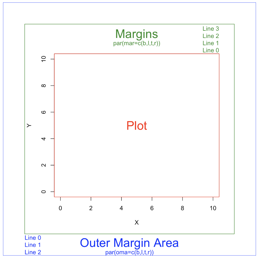
The parameter section fixes the settings for all your plots, basically the plot options. Adding attributes via par() before you call the plot creates ‘global’ settings for your plot.
In the example below, we have set two commonly used optional attributes in the global plot settings.
- The
mfrowspecifies that we have one row and two columns of plots — that is, two plots side by side. - The
marattribute is a vector of our margin widths, with the first value indicating the margin below the plot (5), the second indicating the margin to the left of the plot (5), the third, the top of the plot(4), and the fourth to the left (1).
par(mfrow = c(1,2), mar = c(5,5,4,1))1. Parameters
Lots of parameters options
However, there are many more parameter options that can be specified in the ‘global’ settings or specific to a certain plot option.
Set or Query Graphical Parameters
Description:
 'par' can be used to set or query graphical parameters.
 Parameters can be set by specifying them as arguments to 'par' in
 'tag = value' form, or by passing them as a list of tagged values.
Usage:
 par(..., no.readonly = FALSE)

 <highlevel plot> (...., <tag> = <value>)
Arguments:
 ...: arguments in 'tag = value' form, a single list of tagged
      values, or character vectors of parameter names. Supported
      parameters are described in the 'Graphical Parameters'
      section.
no.readonly: logical; if ‘TRUE’ and there are no other arguments, only parameters are returned which can be set by a subsequent ‘par()’ call on the same device.
Details:
 Each device has its own set of graphical parameters.  If the
 current device is the null device, 'par' will open a new device
 before querying/setting parameters.  (What device is controlled by
 'options("device")'.)

 Parameters are queried by giving one or more character vectors of
 parameter names to 'par'.

 'par()' (no arguments) or 'par(no.readonly = TRUE)' is used to get
 _all_ the graphical parameters (as a named list).  Their names are
 currently taken from the unexported variable 'graphics:::.Pars'.

 _*R.O.*_ indicates _*read-only arguments*_: These may only be used
 in queries and cannot be set.  ('"cin"', '"cra"', '"csi"',
 '"cxy"', '"din"' and '"page"' are always read-only.)

 Several parameters can only be set by a call to 'par()':

    • '"ask"',

    • '"fig"', '"fin"',

    • '"lheight"',

    • '"mai"', '"mar"', '"mex"', '"mfcol"', '"mfrow"', '"mfg"',

    • '"new"',

    • '"oma"', '"omd"', '"omi"',

    • '"pin"', '"plt"', '"ps"', '"pty"',

    • '"usr"',

    • '"xlog"', '"ylog"',

    • '"ylbias"'

 The remaining parameters can also be set as arguments (often via
 '...') to high-level plot functions such as 'plot.default',
 'plot.window', 'points', 'lines', 'abline', 'axis', 'title',
 'text', 'mtext', 'segments', 'symbols', 'arrows', 'polygon',
 'rect', 'box', 'contour', 'filled.contour' and 'image'.  Such
 settings will be active during the execution of the function,
 only.  However, see the comments on 'bg', 'cex', 'col', 'lty',
 'lwd' and 'pch' which may be taken as _arguments_ to certain plot
 functions rather than as graphical parameters.

 The meaning of 'character size' is not well-defined: this is set
 up for the device taking 'pointsize' into account but often not
 the actual font family in use.  Internally the corresponding pars
 ('cra', 'cin', 'cxy' and 'csi') are used only to set the
 inter-line spacing used to convert 'mar' and 'oma' to physical
 margins.  (The same inter-line spacing multiplied by 'lheight' is
 used for multi-line strings in 'text' and 'strheight'.)

 Note that graphical parameters are suggestions: plotting functions
 and devices need not make use of them (and this is particularly
 true of non-default methods for e.g. 'plot').
Value:
 When parameters are set, their previous values are returned in an
 invisible named list.  Such a list can be passed as an argument to
 'par' to restore the parameter values.  Use 'par(no.readonly =
 TRUE)' for the full list of parameters that can be restored.
 However, restoring all of these is not wise: see the 'Note'
 section.

 When just one parameter is queried, the value of that parameter is
 returned as (atomic) vector.  When two or more parameters are
 queried, their values are returned in a list, with the list names
 giving the parameters.

 Note the inconsistency: setting one parameter returns a list, but
 querying one parameter returns a vector.
Graphical Parameters:
 'adj' The value of 'adj' determines the way in which text strings
      are justified in 'text', 'mtext' and 'title'.  A value of '0'
      produces left-justified text, '0.5' (the default) centered
      text and '1' right-justified text.  (Any value in [0, 1] is
      allowed, and on most devices values outside that interval
      will also work.)

      Note that the 'adj' _argument_ of 'text' also allows 'adj =
      c(x, y)' for different adjustment in x- and y- directions.
      Note that whereas for 'text' it refers to positioning of text
      about a point, for 'mtext' and 'title' it controls placement
      within the plot or device region.

 'ann' If set to 'FALSE', high-level plotting functions calling
      'plot.default' do not annotate the plots they produce with
      axis titles and overall titles.  The default is to do
      annotation.

 'ask' logical.  If 'TRUE' (and the R session is interactive) the
      user is asked for input, before a new figure is drawn.  As
      this applies to the device, it also affects output by
      packages 'grid' and 'lattice'.  It can be set even on
      non-screen devices but may have no effect there.

      This not really a graphics parameter, and its use is
      deprecated in favour of 'devAskNewPage'.

 'bg' The color to be used for the background of the device region.
      When called from 'par()' it also sets 'new = FALSE'. See
      section 'Color Specification' for suitable values.  For many
      devices the initial value is set from the 'bg' argument of
      the device, and for the rest it is normally '"white"'.

      Note that some graphics functions such as 'plot.default' and
      'points' have an _argument_ of this name with a different
      meaning.

 'bty' A character string which determined the type of 'box' which
      is drawn about plots.  If 'bty' is one of '"o"' (the
      default), '"l"', '"7"', '"c"', '"u"', or '"]"' the resulting
      box resembles the corresponding upper case letter.  A value
      of '"n"' suppresses the box.

 'cex' A numerical value giving the amount by which plotting text
      and symbols should be magnified relative to the default.
      This starts as '1' when a device is opened, and is reset when
      the layout is changed, e.g. by setting 'mfrow'.

      Note that some graphics functions such as 'plot.default' have
      an _argument_ of this name which _multiplies_ this graphical
      parameter, and some functions such as 'points' and 'text'
      accept a vector of values which are recycled.

 'cex.axis' The magnification to be used for axis annotation
      relative to the current setting of 'cex'.

 'cex.lab' The magnification to be used for x and y labels relative
      to the current setting of 'cex'.

 'cex.main' The magnification to be used for main titles relative
      to the current setting of 'cex'.

 'cex.sub' The magnification to be used for sub-titles relative to
      the current setting of 'cex'.

 'cin' _*R.O.*_; character size '(width, height)' in inches.  These
      are the same measurements as 'cra', expressed in different
      units.

 'col' A specification for the default plotting color.  See section
      'Color Specification'.

      Some functions such as 'lines' and 'text' accept a vector of
      values which are recycled and may be interpreted slightly
      differently.

 'col.axis' The color to be used for axis annotation.  Defaults to
      '"black"'.

 'col.lab' The color to be used for x and y labels.  Defaults to
      '"black"'.

 'col.main' The color to be used for plot main titles.  Defaults to
      '"black"'.

 'col.sub' The color to be used for plot sub-titles.  Defaults to
      '"black"'.

 'cra' _*R.O.*_; size of default character '(width, height)' in
      'rasters' (pixels).  Some devices have no concept of pixels
      and so assume an arbitrary pixel size, usually 1/72 inch.
      These are the same measurements as 'cin', expressed in
      different units.

 'crt' A numerical value specifying (in degrees) how single
      characters should be rotated.  It is unwise to expect values
      other than multiples of 90 to work.  Compare with 'srt' which
      does string rotation.

 'csi' _*R.O.*_; height of (default-sized) characters in inches.
      The same as 'par("cin")[2]'.

 'cxy' _*R.O.*_; size of default character '(width, height)' in
      user coordinate units.  'par("cxy")' is
      'par("cin")/par("pin")' scaled to user coordinates.  Note
      that 'c(strwidth(ch), strheight(ch))' for a given string 'ch'
      is usually much more precise.

 'din' _*R.O.*_; the device dimensions, '(width, height)', in
      inches.  See also 'dev.size', which is updated immediately
      when an on-screen device windows is re-sized.

 'err' (_Unimplemented_; R is silent when points outside the plot
      region are _not_ plotted.)  The degree of error reporting
      desired.

 'family' The name of a font family for drawing text.  The maximum
      allowed length is 200 bytes.  This name gets mapped by each
      graphics device to a device-specific font description.  The
      default value is '""' which means that the default device
      fonts will be used (and what those are should be listed on
      the help page for the device).  Standard values are
      '"serif"', '"sans"' and '"mono"', and the Hershey font
      families are also available.  (Devices may define others, and
      some devices will ignore this setting completely.  Names
      starting with '"Hershey"' are treated specially and should
      only be used for the built-in Hershey font families.)  This
      can be specified inline for 'text'.

 'fg' The color to be used for the foreground of plots.  This is
      the default color used for things like axes and boxes around
      plots.  When called from 'par()' this also sets parameter
      'col' to the same value.  See section 'Color Specification'.
      A few devices have an argument to set the initial value,
      which is otherwise '"black"'.

 'fig' A numerical vector of the form 'c(x1, x2, y1, y2)' which
      gives the (NDC) coordinates of the figure region in the
      display region of the device. If you set this, unlike S, you
      start a new plot, so to add to an existing plot use 'new =
      TRUE' as well.

 'fin' The figure region dimensions, '(width, height)', in inches.
      If you set this, unlike S, you start a new plot.

 'font' An integer which specifies which font to use for text.  If
      possible, device drivers arrange so that 1 corresponds to
      plain text (the default), 2 to bold face, 3 to italic and 4
      to bold italic.  Also, font 5 is expected to be the symbol
      font, in Adobe symbol encoding.  On some devices font
      families can be selected by 'family' to choose different sets
      of 5 fonts.

 'font.axis' The font to be used for axis annotation.

 'font.lab' The font to be used for x and y labels.

 'font.main' The font to be used for plot main titles.

 'font.sub' The font to be used for plot sub-titles.

 'lab' A numerical vector of the form 'c(x, y, len)' which modifies
      the default way that axes are annotated.  The values of 'x'
      and 'y' give the (approximate) number of tickmarks on the x
      and y axes and 'len' specifies the label length.  The default
      is 'c(5, 5, 7)'.  'len' _is unimplemented_ in R.

 'las' numeric in {0,1,2,3}; the style of axis labels.

      0: always parallel to the axis [_default_],

      1: always horizontal,

      2: always perpendicular to the axis,

      3: always vertical.

      Also supported by 'mtext'.  Note that string/character
      rotation _via_ argument 'srt' to 'par' does _not_ affect the
      axis labels.

 'lend' The line end style.  This can be specified as an integer or
      string:

      '0' and '"round"' mean rounded line caps [_default_];

      '1' and '"butt"' mean butt line caps;

      '2' and '"square"' mean square line caps.

 'lheight' The line height multiplier.  The height of a line of
      text (used to vertically space multi-line text) is found by
      multiplying the character height both by the current
      character expansion and by the line height multiplier.
      Default value is 1.  Used in 'text' and 'strheight'.

 'ljoin' The line join style.  This can be specified as an integer
      or string:

      '0' and '"round"' mean rounded line joins [_default_];

      '1' and '"mitre"' mean mitred line joins;

      '2' and '"bevel"' mean bevelled line joins.

 'lmitre' The line mitre limit.  This controls when mitred line
      joins are automatically converted into bevelled line joins.
      The value must be larger than 1 and the default is 10.  Not
      all devices will honour this setting.

 'lty' The line type.  Line types can either be specified as an
      integer (0=blank, 1=solid (default), 2=dashed, 3=dotted,
      4=dotdash, 5=longdash, 6=twodash) or as one of the character
      strings '"blank"', '"solid"', '"dashed"', '"dotted"',
      '"dotdash"', '"longdash"', or '"twodash"', where '"blank"'
      uses 'invisible lines' (i.e., does not draw them).

      Alternatively, a string of up to 8 characters (from 'c(1:9,
      "A":"F")') may be given, giving the length of line segments
      which are alternatively drawn and skipped.  See section 'Line
      Type Specification'.

      Functions such as 'lines' and 'segments' accept a vector of
      values which are recycled.

 'lwd' The line width, a _positive_ number, defaulting to '1'.  The
      interpretation is device-specific, and some devices do not
      implement line widths less than one.  (See the help on the
      device for details of the interpretation.)

      Functions such as 'lines' and 'segments' accept a vector of
      values which are recycled: in such uses lines corresponding
      to values 'NA' or 'NaN' are omitted.  The interpretation of
      '0' is device-specific.

 'mai' A numerical vector of the form 'c(bottom, left, top, right)'
      which gives the margin size specified in inches.

 'mar' A numerical vector of the form 'c(bottom, left, top, right)'
      which gives the number of lines of margin to be specified on
      the four sides of the plot.  The default is 'c(5, 4, 4, 2) +
      0.1'.

 'mex' 'mex' is a character size expansion factor which is used to
      describe coordinates in the margins of plots. Note that this
      does not change the font size, rather specifies the size of
      font (as a multiple of 'csi') used to convert between 'mar'
      and 'mai', and between 'oma' and 'omi'.

      This starts as '1' when the device is opened, and is reset
      when the layout is changed (alongside resetting 'cex').

 'mfcol, mfrow' A vector of the form 'c(nr, nc)'.  Subsequent
      figures will be drawn in an 'nr'-by-'nc' array on the device
      by _columns_ ('mfcol'), or _rows_ ('mfrow'), respectively.

      In a layout with exactly two rows and columns the base value
      of '"cex"' is reduced by a factor of 0.83: if there are three
      or more of either rows or columns, the reduction factor is
      0.66.

      Setting a layout resets the base value of 'cex' and that of
      'mex' to '1'.

      If either of these is queried it will give the current
      layout, so querying cannot tell you the order in which the
      array will be filled.

      Consider the alternatives, 'layout' and 'split.screen'.

 'mfg' A numerical vector of the form 'c(i, j)' where 'i' and 'j'
      indicate which figure in an array of figures is to be drawn
      next (if setting) or is being drawn (if enquiring).  The
      array must already have been set by 'mfcol' or 'mfrow'.

      For compatibility with S, the form 'c(i, j, nr, nc)' is also
      accepted, when 'nr' and 'nc' should be the current number of
      rows and number of columns.  Mismatches will be ignored, with
      a warning.

 'mgp' The margin line (in 'mex' units) for the axis title, axis
      labels and axis line.  Note that 'mgp[1]' affects 'title'
      whereas 'mgp[2:3]' affect 'axis'.  The default is 'c(3, 1,
      0)'.

 'mkh' The height in inches of symbols to be drawn when the value
      of 'pch' is an integer. _Completely ignored in R_.

 'new' logical, defaulting to 'FALSE'.  If set to 'TRUE', the next
      high-level plotting command (actually 'plot.new') should _not
      clean_ the frame before drawing _as if it were on a *_new_*
      device_.  It is an error (ignored with a warning) to try to
      use 'new = TRUE' on a device that does not currently contain
      a high-level plot.

 'oma' A vector of the form 'c(bottom, left, top, right)' giving
      the size of the outer margins in lines of text.

 'omd' A vector of the form 'c(x1, x2, y1, y2)' giving the region
      _inside_ outer margins in NDC (= normalized device
      coordinates), i.e., as a fraction (in [0, 1]) of the device
      region.

 'omi' A vector of the form 'c(bottom, left, top, right)' giving
      the size of the outer margins in inches.

 'page' _*R.O.*_; A boolean value indicating whether the next call
      to 'plot.new' is going to start a new page.  This value may
      be 'FALSE' if there are multiple figures on the page.

 'pch' Either an integer specifying a symbol or a single character
      to be used as the default in plotting points.  See 'points'
      for possible values and their interpretation.  Note that only
      integers and single-character strings can be set as a
      graphics parameter (and not 'NA' nor 'NULL').

      Some functions such as 'points' accept a vector of values
      which are recycled.

 'pin' The current plot dimensions, '(width, height)', in inches.

 'plt' A vector of the form 'c(x1, x2, y1, y2)' giving the
      coordinates of the plot region as fractions of the current
      figure region.

 'ps' integer; the point size of text (but not symbols).  Unlike
      the 'pointsize' argument of most devices, this does not
      change the relationship between 'mar' and 'mai' (nor 'oma'
      and 'omi').

      What is meant by 'point size' is device-specific, but most
      devices mean a multiple of 1bp, that is 1/72 of an inch.

 'pty' A character specifying the type of plot region to be used;
      '"s"' generates a square plotting region and '"m"' generates
      the maximal plotting region.

 'smo' (_Unimplemented_) a value which indicates how smooth circles
      and circular arcs should be.

 'srt' The string rotation in degrees.  See the comment about
      'crt'.  Only supported by 'text'.

 'tck' The length of tick marks as a fraction of the smaller of the
      width or height of the plotting region.  If 'tck >= 0.5' it
      is interpreted as a fraction of the relevant side, so if 'tck
      = 1' grid lines are drawn.  The default setting ('tck = NA')
      is to use 'tcl = -0.5'.

 'tcl' The length of tick marks as a fraction of the height of a
      line of text.  The default value is '-0.5'; setting 'tcl =
      NA' sets 'tck = -0.01' which is S' default.

 'usr' A vector of the form 'c(x1, x2, y1, y2)' giving the extremes
      of the user coordinates of the plotting region.  When a
      logarithmic scale is in use (i.e., 'par("xlog")' is true, see
      below), then the x-limits will be '10 ^ par("usr")[1:2]'.
      Similarly for the y-axis.

 'xaxp' A vector of the form 'c(x1, x2, n)' giving the coordinates
      of the extreme tick marks and the number of intervals between
      tick-marks when 'par("xlog")' is false.  Otherwise, when
      _log_ coordinates are active, the three values have a
      different meaning: For a small range, 'n' is _negative_, and
      the ticks are as in the linear case, otherwise, 'n' is in
      '1:3', specifying a case number, and 'x1' and 'x2' are the
      lowest and highest power of 10 inside the user coordinates,
      '10 ^ par("usr")[1:2]'. (The '"usr"' coordinates are
      log10-transformed here!)

      n = 1 will produce tick marks at 10^j for integer j,

      n = 2 gives marks k 10^j with k in {1,5},

      n = 3 gives marks k 10^j with k in {1,2,5}.

      See 'axTicks()' for a pure R implementation of this.

      This parameter is reset when a user coordinate system is set
      up, for example by starting a new page or by calling
      'plot.window' or setting 'par("usr")': 'n' is taken from
      'par("lab")'.  It affects the default behaviour of subsequent
      calls to 'axis' for sides 1 or 3.

      It is only relevant to default numeric axis systems, and not
      for example to dates.

 'xaxs' The style of axis interval calculation to be used for the
      x-axis.  Possible values are '"r"', '"i"', '"e"', '"s"',
      '"d"'.  The styles are generally controlled by the range of
      data or 'xlim', if given.
      Style '"r"' (regular) first extends the data range by 4
      percent at each end and then finds an axis with pretty labels
      that fits within the extended range.
      Style '"i"' (internal) just finds an axis with pretty labels
      that fits within the original data range.
      Style '"s"' (standard) finds an axis with pretty labels
      within which the original data range fits.
      Style '"e"' (extended) is like style '"s"', except that it is
      also ensures that there is room for plotting symbols within
      the bounding box.
      Style '"d"' (direct) specifies that the current axis should
      be used on subsequent plots.
      (_Only '"r"' and '"i"' styles have been implemented in R._)

 'xaxt' A character which specifies the x axis type.  Specifying
      '"n"' suppresses plotting of the axis.  The standard value is
      '"s"': for compatibility with S values '"l"' and '"t"' are
      accepted but are equivalent to '"s"': any value other than
      '"n"' implies plotting.

 'xlog' A logical value (see 'log' in 'plot.default').  If 'TRUE',
      a logarithmic scale is in use (e.g., after 'plot(*, log =
      "x")').  For a new device, it defaults to 'FALSE', i.e.,
      linear scale.

 'xpd' A logical value or 'NA'.  If 'FALSE', all plotting is
      clipped to the plot region, if 'TRUE', all plotting is
      clipped to the figure region, and if 'NA', all plotting is
      clipped to the device region.  See also 'clip'.

 'yaxp' A vector of the form 'c(y1, y2, n)' giving the coordinates
      of the extreme tick marks and the number of intervals between
      tick-marks unless for log coordinates, see 'xaxp' above.

 'yaxs' The style of axis interval calculation to be used for the
      y-axis.  See 'xaxs' above.

 'yaxt' A character which specifies the y axis type.  Specifying
      '"n"' suppresses plotting.

 'ylbias' A positive real value used in the positioning of text in
      the margins by 'axis' and 'mtext'.  The default is in
      principle device-specific, but currently '0.2' for all of R's
      own devices.  Set this to '0.2' for compatibility with R <
      2.14.0 on 'x11' and 'windows()' devices.

 'ylog' A logical value; see 'xlog' above.
Color Specification:
 Colors can be specified in several different ways. The simplest
 way is with a character string giving the color name (e.g.,
 '"red"').  A list of the possible colors can be obtained with the
 function 'colors'.  Alternatively, colors can be specified
 directly in terms of their RGB components with a string of the
 form '"#RRGGBB"' where each of the pairs 'RR', 'GG', 'BB' consist
 of two hexadecimal digits giving a value in the range '00' to
 'FF'.  Hexadecimal colors can be in the long hexadecimal form
 (e.g., '"#rrggbb"' or '"#rrggbbaa"') or the short form (e.g,
 '"#rgb"' or '"#rgba"'). The short form is expanded to the long
 form by replicating digits (not by adding zeroes), e.g., '"#rgb"'
 becomes '"#rrggbb"'. Colors can also be specified by giving an
 index into a small table of colors, the 'palette': indices wrap
 round so with the default palette of size 8, '10' is the same as
 '2'.  This provides compatibility with S.  Index '0' corresponds
 to the background color.  Note that the palette (apart from '0'
 which is per-device) is a per-session setting.

 Negative integer colours are errors.

 Additionally, '"transparent"' is _transparent_, useful for filled
 areas (such as the background!), and just invisible for things
 like lines or text.  In most circumstances (integer) 'NA' is
 equivalent to '"transparent"' (but not for 'text' and 'mtext').

 Semi-transparent colors are available for use on devices that
 support them.

 The functions 'rgb', 'hsv', 'hcl', 'gray' and 'rainbow' provide
 additional ways of generating colors.
Line Type Specification:
 Line types can either be specified by giving an index into a small
 built-in table of line types (1 = solid, 2 = dashed, etc, see
 'lty' above) or directly as the lengths of on/off stretches of
 line.  This is done with a string of an even number (up to eight)
 of characters, namely _non-zero_ (hexadecimal) digits which give
 the lengths in consecutive positions in the string.  For example,
 the string '"33"' specifies three units on followed by three off
 and '"3313"' specifies three units on followed by three off
 followed by one on and finally three off.  The 'units' here are
 (on most devices) proportional to 'lwd', and with 'lwd = 1' are in
 pixels or points or 1/96 inch.

 The five standard dash-dot line types ('lty = 2:6') correspond to
 'c("44", "13", "1343", "73", "2262")'.

 Note that 'NA' is not a valid value for 'lty'.
Note:
 The effect of restoring all the (settable) graphics parameters as
 in the examples is hard to predict if the device has been resized.
 Several of them are attempting to set the same things in different
 ways, and those last in the alphabet will win.  In particular, the
 settings of 'mai', 'mar', 'pin', 'plt' and 'pty' interact, as do
 the outer margin settings, the figure layout and figure region
 size.
References:
 Becker, R. A., Chambers, J. M. and Wilks, A. R. (1988) _The New S
 Language_.  Wadsworth & Brooks/Cole.

 Murrell, P. (2005) _R Graphics_. Chapman & Hall/CRC Press.
See Also:
 'plot.default' for some high-level plotting parameters; 'colors';
 'clip'; 'options' for other setup parameters; graphic devices
 'x11', 'pdf', 'postscript' and setting up device regions by
 'layout' and 'split.screen'.
Examples:
 op <- par(mfrow = c(2, 2), # 2 x 2 pictures on one plot
           pty = "s")       # square plotting region,
                            # independent of device size

 ## At end of plotting, reset to previous settings:
 par(op)

 ## Alternatively,
 op <- par(no.readonly = TRUE) # the whole list of settable par's.
 ## do lots of plotting and par(.) calls, then reset:
 par(op)
 ## Note this is not in general good practice

 par("ylog") # FALSE
 plot(1 : 12, log = "y")
 par("ylog") # TRUE

 plot(1:2, xaxs = "i") # 'inner axis' w/o extra space
 par(c("usr", "xaxp"))

 ( nr.prof <-
 c(prof.pilots = 16, lawyers = 11, farmers = 10, salesmen = 9, physicians = 9,
   mechanics = 6, policemen = 6, managers = 6, engineers = 5, teachers = 4,
   housewives = 3, students = 3, armed.forces = 1))
 par(las = 3)
 barplot(rbind(nr.prof)) # R 0.63.2: shows alignment problem
 par(las = 0)  # reset to default

 require(grDevices) # for gray
 ## 'fg' use:
 plot(1:12, type = "b", main = "'fg' : axes, ticks and box in gray",
      fg = gray(0.7), bty = "7" , sub = R.version.string)

 ex <- function() {
    old.par <- par(no.readonly = TRUE) # all par settings which
                                       # could be changed.
    on.exit(par(old.par))
    ## ...
    ## ... do lots of par() settings and plots
    ## ...
    invisible() #-- now,  par(old.par)  will be executed
 }
 ex()

 ## Line types
 showLty <- function(ltys, xoff = 0, ...) {
    stopifnot((n <- length(ltys)) >= 1)
    op <- par(mar = rep(.5,4)); on.exit(par(op))
    plot(0:1, 0:1, type = "n", axes = FALSE, ann = FALSE)
    y <- (n:1)/(n+1)
    clty <- as.character(ltys)
    mytext <- function(x, y, txt)
       text(x, y, txt, adj = c(0, -.3), cex = 0.8, ...)
    abline(h = y, lty = ltys, ...); mytext(xoff, y, clty)
    y <- y - 1/(3*(n+1))
    abline(h = y, lty = ltys, lwd = 2, ...)
    mytext(1/8+xoff, y, paste(clty," lwd = 2"))
 }
 showLty(c("solid", "dashed", "dotted", "dotdash", "longdash", "twodash"))
 par(new = TRUE)  # the same:
 showLty(c("solid", "44", "13", "1343", "73", "2262"), xoff = .2, col = 2)
 showLty(c("11", "22", "33", "44",   "12", "13", "14",   "21", "31"))
Common parameter options
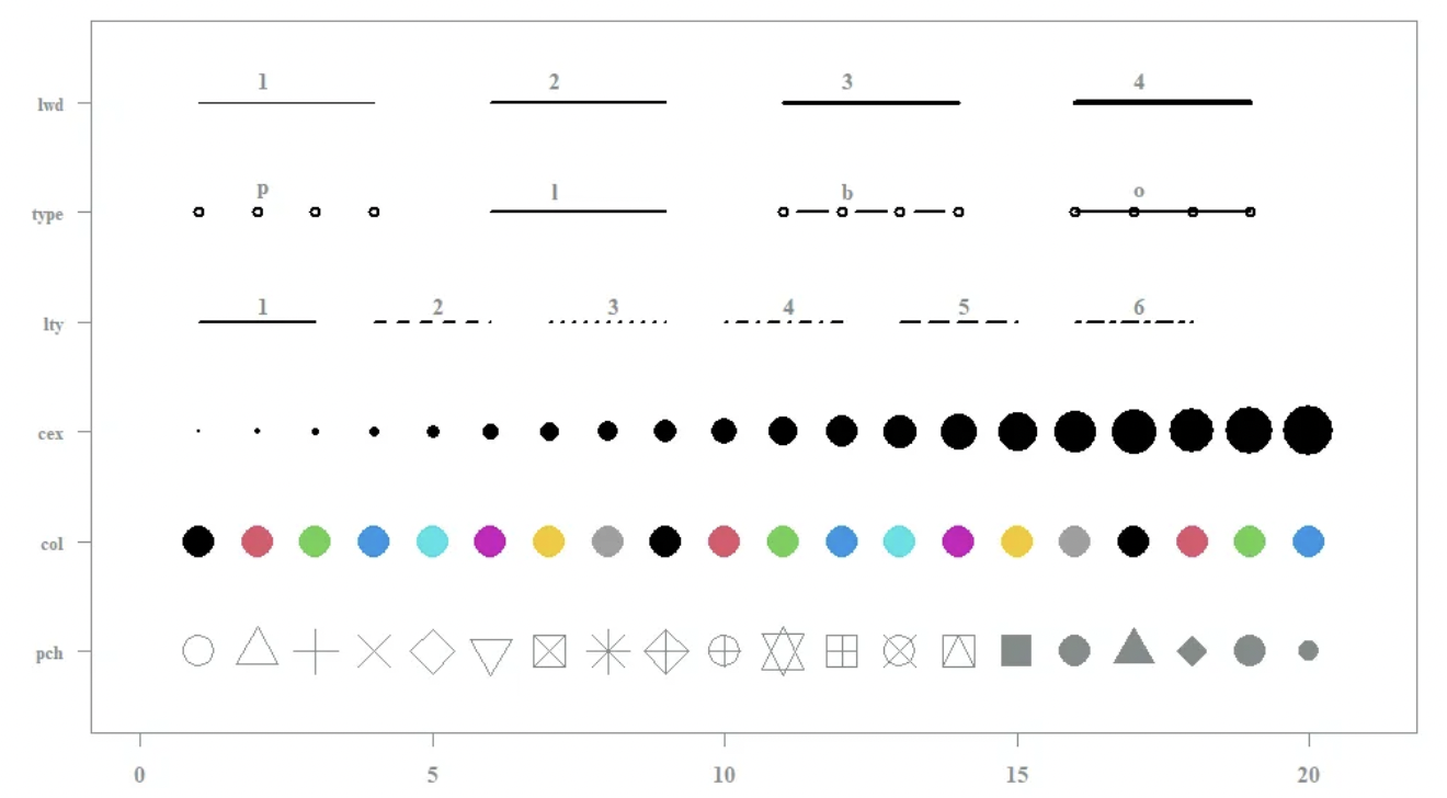
Eight useful parameter arguments help improve the readability of the plot:
xlab: specifies the x-axis label of the plotylab: specifies the y-axis labelmain: titles your graphpch: specifies the symbology of your graphlty: specifies the line type of your graphlwd: specifies line thicknesscex: specifies sizecol: specifies the colors for your graph.
We will explore use of these arguments below.
Common parameter options
2. Plot Attributes
Plot attributes are those that map your data to the plot. This mean this is where you specify what variables in the data frame you want to plot.
We will only look at four types of plots today:
hist()displays histogram of one variableplot()displays x-y plot of two variablesboxplot()displays boxplotbarplot()displays barplot
hist() Help File
Histograms
Description:
 The generic function 'hist' computes a histogram of the given data
 values.  If 'plot = TRUE', the resulting object of class
 '"histogram"' is plotted by 'plot.histogram', before it is
 returned.
Usage:
 hist(x, ...)

 ## Default S3 method:
 hist(x, breaks = "Sturges",
      freq = NULL, probability = !freq,
      include.lowest = TRUE, right = TRUE, fuzz = 1e-7,
      density = NULL, angle = 45, col = "lightgray", border = NULL,
      main = paste("Histogram of" , xname),
      xlim = range(breaks), ylim = NULL,
      xlab = xname, ylab,
      axes = TRUE, plot = TRUE, labels = FALSE,
      nclass = NULL, warn.unused = TRUE, ...)
Arguments:
x: a vector of values for which the histogram is desired.breaks: one of:
        • a vector giving the breakpoints between histogram cells,

        • a function to compute the vector of breakpoints,

        • a single number giving the number of cells for the
          histogram,

        • a character string naming an algorithm to compute the
          number of cells (see 'Details'),

        • a function to compute the number of cells.

      In the last three cases the number is a suggestion only; as
      the breakpoints will be set to 'pretty' values, the number is
      limited to '1e6' (with a warning if it was larger).  If
      'breaks' is a function, the 'x' vector is supplied to it as
      the only argument (and the number of breaks is only limited
      by the amount of available memory).

freq: logical; if 'TRUE', the histogram graphic is a representation
      of frequencies, the 'counts' component of the result; if
      'FALSE', probability densities, component 'density', are
      plotted (so that the histogram has a total area of one).
      Defaults to 'TRUE' _if and only if_ 'breaks' are equidistant
      (and 'probability' is not specified).
probability: an alias for ‘!freq’, for S compatibility.
include.lowest: logical; if ‘TRUE’, an ‘x[i]’ equal to the ‘breaks’ value will be included in the first (or last, for ‘right = FALSE’) bar. This will be ignored (with a warning) unless ‘breaks’ is a vector.
right: logical; if ‘TRUE’, the histogram cells are right-closed (left open) intervals.
fuzz: non-negative number, for the case when the data is "pretty"
      and some observations 'x[.]' are close but not exactly on a
      'break'.  For counting fuzzy breaks proportional to 'fuzz'
      are used.  The default is occasionally suboptimal.
density: the density of shading lines, in lines per inch. The default value of ‘NULL’ means that no shading lines are drawn. Non-positive values of ‘density’ also inhibit the drawing of shading lines.
angle: the slope of shading lines, given as an angle in degrees (counter-clockwise).
col: a colour to be used to fill the bars.border: the color of the border around the bars. The default is to use the standard foreground color.
main, xlab, ylab: main title and axis labels: these arguments to ‘title()’ get “smart” defaults here, e.g., the default ‘ylab’ is ‘“Frequency”’ iff ‘freq’ is true.
xlim, ylim: the range of x and y values with sensible defaults. Note that ‘xlim’ is not used to define the histogram (breaks), but only for plotting (when ‘plot = TRUE’).
axes: logical.  If 'TRUE' (default), axes are draw if the plot is
      drawn.

plot: logical.  If 'TRUE' (default), a histogram is plotted,
      otherwise a list of breaks and counts is returned.  In the
      latter case, a warning is used if (typically graphical)
      arguments are specified that only apply to the 'plot = TRUE'
      case.
labels: logical or character string. Additionally draw labels on top of bars, if not ‘FALSE’; see ‘plot.histogram’.
nclass: numeric (integer). For S(-PLUS) compatibility only, ‘nclass’ is equivalent to ‘breaks’ for a scalar or character argument.
warn.unused: logical. If ‘plot = FALSE’ and ‘warn.unused = TRUE’, a warning will be issued when graphical parameters are passed to ‘hist.default()’.
 ...: further arguments and graphical parameters passed to
      'plot.histogram' and thence to 'title' and 'axis' (if 'plot =
      TRUE').
Details:
 The definition of _histogram_ differs by source (with
 country-specific biases).  R's default with equispaced breaks
 (also the default) is to plot the counts in the cells defined by
 'breaks'.  Thus the height of a rectangle is proportional to the
 number of points falling into the cell, as is the area _provided_
 the breaks are equally-spaced.

 The default with non-equispaced breaks is to give a plot of area
 one, in which the _area_ of the rectangles is the fraction of the
 data points falling in the cells.

 If 'right = TRUE' (default), the histogram cells are intervals of
 the form (a, b], i.e., they include their right-hand endpoint, but
 not their left one, with the exception of the first cell when
 'include.lowest' is 'TRUE'.

 For 'right = FALSE', the intervals are of the form [a, b), and
 'include.lowest' means '_include highest_'.

 A numerical tolerance of 1e-7 times the median bin size (for more
 than four bins, otherwise the median is substituted) is applied
 when counting entries on the edges of bins.  This is not included
 in the reported 'breaks' nor in the calculation of 'density'.

 The default for 'breaks' is '"Sturges"': see 'nclass.Sturges'.
 Other names for which algorithms are supplied are '"Scott"' and
 '"FD"' / '"Freedman-Diaconis"' (with corresponding functions
 'nclass.scott' and 'nclass.FD').  Case is ignored and partial
 matching is used.  Alternatively, a function can be supplied which
 will compute the intended number of breaks or the actual
 breakpoints as a function of 'x'.
Value:
an object of class '"histogram"' which is a list with components:breaks: the n+1 cell boundaries (= ‘breaks’ if that was a vector). These are the nominal breaks, not with the boundary fuzz.
counts: n integers; for each cell, the number of ‘x[]’ inside.
density: values f^(x[i]), as estimated density values. If ‘all(diff(breaks) == 1)’, they are the relative frequencies ‘counts/n’ and in general satisfy sum[i; f^(x[i]) (b[i+1]-b[i])] = 1, where b[i] = ‘breaks[i]’.
mids: the n cell midpoints.xname: a character string with the actual ‘x’ argument name.
equidist: logical, indicating if the distances between ‘breaks’ are all the same.
References:
 Becker, R. A., Chambers, J. M. and Wilks, A. R. (1988) _The New S
 Language_.  Wadsworth & Brooks/Cole.

 Venables, W. N. and Ripley. B. D. (2002) _Modern Applied
 Statistics with S_.  Springer.
See Also:
 'nclass.Sturges', 'stem', 'density', 'truehist' in package 'MASS'.

 Typical plots with vertical bars are _not_ histograms.  Consider
 'barplot' or 'plot(*, type = "h")' for such bar plots.
Examples:
 op <- par(mfrow = c(2, 2))
 hist(islands)
 utils::str(hist(islands, col = "gray", labels = TRUE))

 hist(sqrt(islands), breaks = 12, col = "lightblue", border = "pink")
 ##-- For non-equidistant breaks, counts should NOT be graphed unscaled:
 r <- hist(sqrt(islands), breaks = c(4*0:5, 10*3:5, 70, 100, 140),
           col = "blue1")
 text(r$mids, r$density, r$counts, adj = c(.5, -.5), col = "blue3")
 sapply(r[2:3], sum)
 sum(r$density * diff(r$breaks)) # == 1
 lines(r, lty = 3, border = "purple") # -> lines.histogram(*)
 par(op)

 require(utils) # for str
 str(hist(islands, breaks = 12, plot =  FALSE)) #-> 10 (~= 12) breaks
 str(hist(islands, breaks = c(12,20,36,80,200,1000,17000), plot = FALSE))

 hist(islands, breaks = c(12,20,36,80,200,1000,17000), freq = TRUE,
      main = "WRONG histogram") # and warning

 ## Extreme outliers; the "FD" rule would take very large number of 'breaks':
 XXL <- c(1:9, c(-1,1)*1e300)
 hh <- hist(XXL, "FD") # did not work in R <= 3.4.1; now gives warning
 ## pretty() determines how many counts are used (platform dependently!):
 length(hh$breaks) ## typically 1 million -- though 1e6 was "a suggestion only"

 ## R >= 4.2.0: no "*.5" labels on y-axis:
 hist(c(2,3,3,5,5,6,6,6,7))

 require(stats)
 set.seed(14)
 x <- rchisq(100, df = 4)

 ## Histogram with custom x-axis:
 hist(x, xaxt = "n")
 axis(1, at = 0:17)


 ## Comparing data with a model distribution should be done with qqplot()!
 qqplot(x, qchisq(ppoints(x), df = 4)); abline(0, 1, col = 2, lty = 2)

 ## if you really insist on using hist() ... :
 hist(x, freq = FALSE, ylim = c(0, 0.2))
 curve(dchisq(x, df = 4), col = 2, lty = 2, lwd = 2, add = TRUE)
hist() example
Reminder function signature
hist(x, breaks = "Sturges",
freq = NULL, probability = !freq,
include.lowest = TRUE, right = TRUE, fuzz = 1e-7,
density = NULL, angle = 45, col = "lightgray", border = NULL,
main = paste("Histogram of" , xname),
xlim = range(breaks), ylim = NULL,
xlab = xname, ylab,
axes = TRUE, plot = TRUE, labels = FALSE,
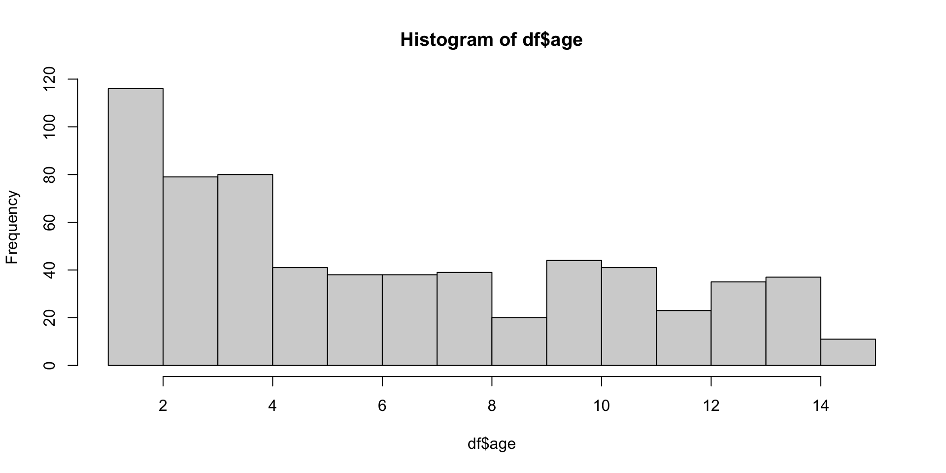
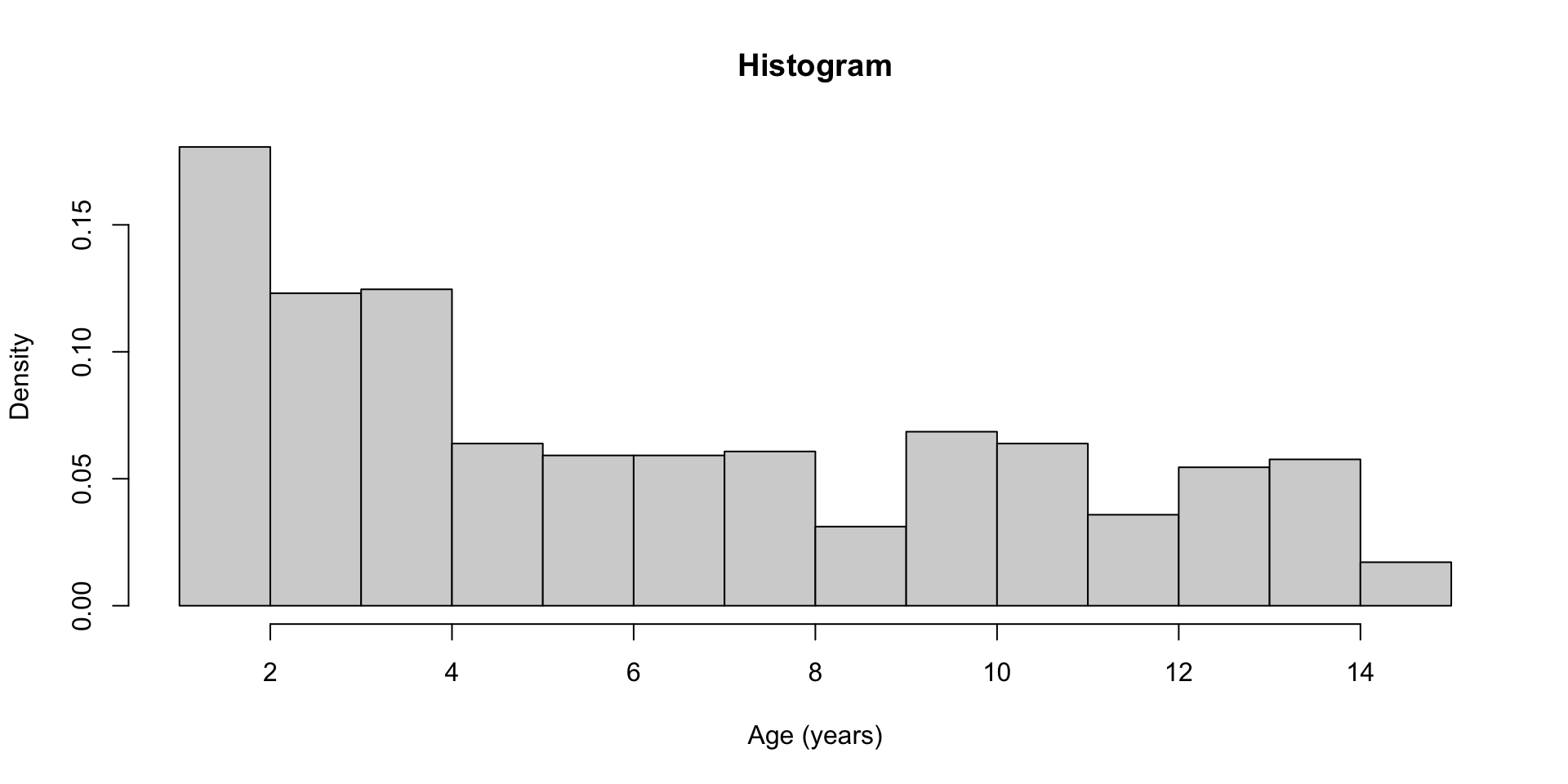
nclass = NULL, warn.unused = TRUE, ...)Let’s practice
plot() Help File
Generic X-Y Plotting
Description:
 Generic function for plotting of R objects.

 For simple scatter plots, 'plot.default' will be used.  However,
 there are 'plot' methods for many R objects, including
 'function's, 'data.frame's, 'density' objects, etc.  Use
 'methods(plot)' and the documentation for these. Most of these
 methods are implemented using traditional graphics (the 'graphics'
 package), but this is not mandatory.

 For more details about graphical parameter arguments used by
 traditional graphics, see 'par'.
Usage:
plot(x, y, ...)
Arguments:
   x: the coordinates of points in the plot. Alternatively, a
      single plotting structure, function or _any R object with a
      'plot' method_ can be provided.

   y: the y coordinates of points in the plot, _optional_ if 'x' is
      an appropriate structure.

 ...: arguments to be passed to methods, such as graphical
      parameters (see 'par').  Many methods will accept the
      following arguments:

      'type' what type of plot should be drawn.  Possible types are

            • '"p"' for *p*oints,

            • '"l"' for *l*ines,

            • '"b"' for *b*oth,

            • '"c"' for the lines part alone of '"b"',

            • '"o"' for both '*o*verplotted',

            • '"h"' for '*h*istogram' like (or 'high-density')
              vertical lines,

            • '"s"' for stair *s*teps,

            • '"S"' for other *s*teps, see 'Details' below,

            • '"n"' for no plotting.

          All other 'type's give a warning or an error; using,
          e.g., 'type = "punkte"' being equivalent to 'type = "p"'
          for S compatibility.  Note that some methods, e.g.
          'plot.factor', do not accept this.

      'main' an overall title for the plot: see 'title'.

      'sub' a subtitle for the plot: see 'title'.

      'xlab' a title for the x axis: see 'title'.

      'ylab' a title for the y axis: see 'title'.

      'asp' the y/x aspect ratio, see 'plot.window'.
Details:
 The two step types differ in their x-y preference: Going from
 (x1,y1) to (x2,y2) with x1 < x2, 'type = "s"' moves first
 horizontal, then vertical, whereas 'type = "S"' moves the other
 way around.
Note:
 The 'plot' generic was moved from the 'graphics' package to the
 'base' package in R 4.0.0. It is currently re-exported from the
 'graphics' namespace to allow packages importing it from there to
 continue working, but this may change in future versions of R.
See Also:
 'plot.default', 'plot.formula' and other methods; 'points',
 'lines', 'par'.  For thousands of points, consider using
 'smoothScatter()' instead of 'plot()'.

 For X-Y-Z plotting see 'contour', 'persp' and 'image'.
Examples:
 require(stats) # for lowess, rpois, rnorm
 require(graphics) # for plot methods
 plot(cars)
 lines(lowess(cars))

 plot(sin, -pi, 2*pi) # see ?plot.function

 ## Discrete Distribution Plot:
 plot(table(rpois(100, 5)), type = "h", col = "red", lwd = 10,
      main = "rpois(100, lambda = 5)")

 ## Simple quantiles/ECDF, see ecdf() {library(stats)} for a better one:
 plot(x <- sort(rnorm(47)), type = "s", main = "plot(x, type = \"s\")")
 points(x, cex = .5, col = "dark red")
plot() example
Adding more stuff to the same plot
- We can use the functions
points()orlines()to add additional points or additional lines to an existing plot.
plot(
    df$age[df$slum == "Non slum"],
    df$IgG_concentration[df$slum == "Non slum"],
    type = "p",
    main = "IgG Concentration vs Age",
    xlab = "Age (years)",
    ylab = "IgG Concentration (IU/mL)",
    pch = 16,
    cex = 0.9,
    col = "lightblue",
    xlim = range(df$age, na.rm = TRUE),
    ylim = range(df$IgG_concentration, na.rm = TRUE)
)
points(
    df$age[df$slum == "Mixed"],
    df$IgG_concentration[df$slum == "Mixed"],
    pch = 16,
    cex = 0.9,
    col = "blue"
)
points(
    df$age[df$slum == "Slum"],
    df$IgG_concentration[df$slum == "Slum"],
    pch = 16,
    cex = 0.9,
    col = "darkblue"
)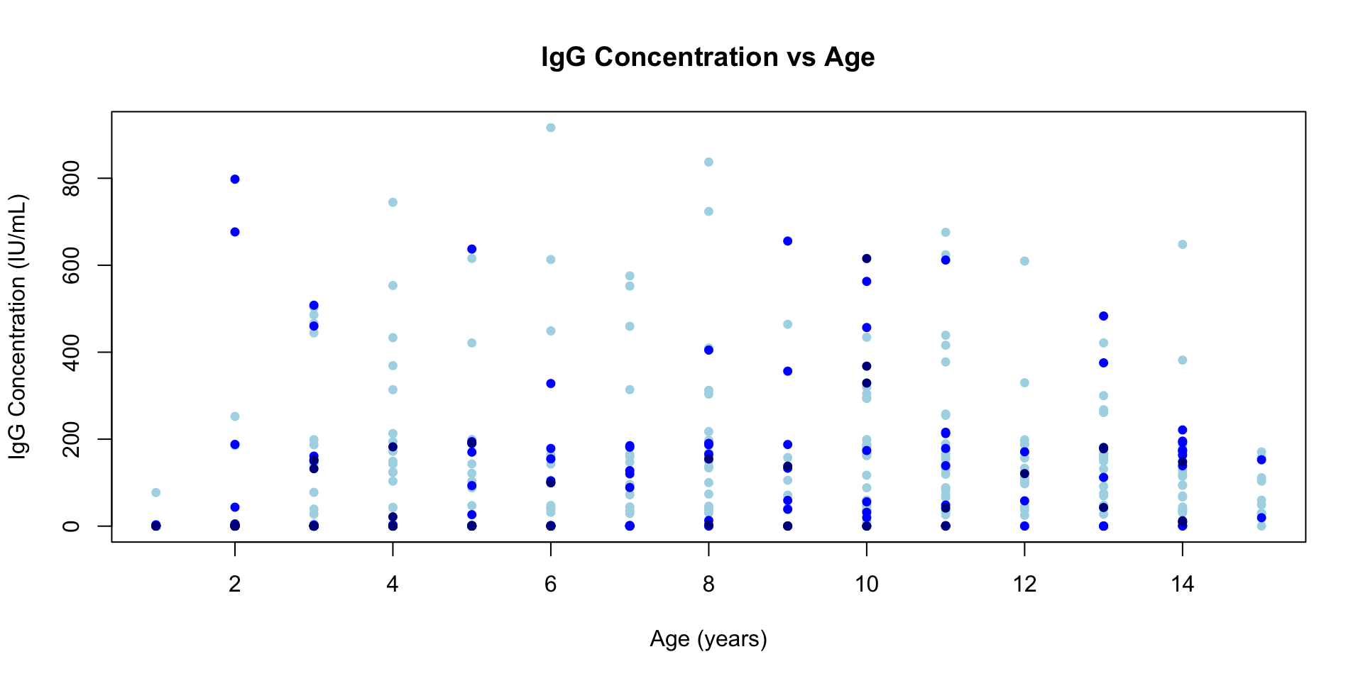
- The
lines()function works similarly for connected lines. - Note that the
points()orlines()functions must be called with aplot()-style function - We will show how we could draw a
legend()in a future section.
boxplot() Help File
Box Plots
Description:
Produce box-and-whisker plot(s) of the given (grouped) values.Usage:
 boxplot(x, ...)

 ## S3 method for class 'formula'
 boxplot(formula, data = NULL, ..., subset, na.action = NULL,
         xlab = mklab(y_var = horizontal),
         ylab = mklab(y_var =!horizontal),
         add = FALSE, ann = !add, horizontal = FALSE,
         drop = FALSE, sep = ".", lex.order = FALSE)

 ## Default S3 method:
 boxplot(x, ..., range = 1.5, width = NULL, varwidth = FALSE,
         notch = FALSE, outline = TRUE, names, plot = TRUE,
         border = par("fg"), col = "lightgray", log = "",
         pars = list(boxwex = 0.8, staplewex = 0.5, outwex = 0.5),
          ann = !add, horizontal = FALSE, add = FALSE, at = NULL)
Arguments:
formula: a formula, such as ‘y ~ grp’, where ‘y’ is a numeric vector of data values to be split into groups according to the grouping variable ‘grp’ (usually a factor). Note that ‘~ g1 + g2’ is equivalent to ‘g1:g2’.
data: a data.frame (or list) from which the variables in 'formula'
      should be taken.
subset: an optional vector specifying a subset of observations to be used for plotting.
na.action: a function which indicates what should happen when the data contain ’NA’s. The default is to ignore missing values in either the response or the group.
xlab, ylab: x- and y-axis annotation, since R 3.6.0 with a non-empty default. Can be suppressed by ‘ann=FALSE’.
 ann: 'logical' indicating if axes should be annotated (by 'xlab'
      and 'ylab').
drop, sep, lex.order: passed to ‘split.default’, see there.
   x: for specifying data from which the boxplots are to be
      produced. Either a numeric vector, or a single list
      containing such vectors. Additional unnamed arguments specify
      further data as separate vectors (each corresponding to a
      component boxplot).  'NA's are allowed in the data.

 ...: For the 'formula' method, named arguments to be passed to the
      default method.

      For the default method, unnamed arguments are additional data
      vectors (unless 'x' is a list when they are ignored), and
      named arguments are arguments and graphical parameters to be
      passed to 'bxp' in addition to the ones given by argument
      'pars' (and override those in 'pars'). Note that 'bxp' may or
      may not make use of graphical parameters it is passed: see
      its documentation.
range: this determines how far the plot whiskers extend out from the box. If ‘range’ is positive, the whiskers extend to the most extreme data point which is no more than ‘range’ times the interquartile range from the box. A value of zero causes the whiskers to extend to the data extremes.
width: a vector giving the relative widths of the boxes making up the plot.
varwidth: if ‘varwidth’ is ‘TRUE’, the boxes are drawn with widths proportional to the square-roots of the number of observations in the groups.
notch: if ‘notch’ is ‘TRUE’, a notch is drawn in each side of the boxes. If the notches of two plots do not overlap this is ‘strong evidence’ that the two medians differ (Chambers et al., 1983, p. 62). See ‘boxplot.stats’ for the calculations used.
outline: if ‘outline’ is not true, the outliers are not drawn (as points whereas S+ uses lines).
names: group labels which will be printed under each boxplot. Can be a character vector or an expression (see plotmath).
boxwex: a scale factor to be applied to all boxes. When there are only a few groups, the appearance of the plot can be improved by making the boxes narrower.
staplewex: staple line width expansion, proportional to box width.
outwex: outlier line width expansion, proportional to box width.
plot: if 'TRUE' (the default) then a boxplot is produced.  If not,
      the summaries which the boxplots are based on are returned.
border: an optional vector of colors for the outlines of the boxplots. The values in ‘border’ are recycled if the length of ‘border’ is less than the number of plots.
 col: if 'col' is non-null it is assumed to contain colors to be
      used to colour the bodies of the box plots. By default they
      are in the background colour.

 log: character indicating if x or y or both coordinates should be
      plotted in log scale.

pars: a list of (potentially many) more graphical parameters, e.g.,
      'boxwex' or 'outpch'; these are passed to 'bxp' (if 'plot' is
      true); for details, see there.
horizontal: logical indicating if the boxplots should be horizontal; default ‘FALSE’ means vertical boxes.
 add: logical, if true _add_ boxplot to current plot.

  at: numeric vector giving the locations where the boxplots should
      be drawn, particularly when 'add = TRUE'; defaults to '1:n'
      where 'n' is the number of boxes.
Details:
 The generic function 'boxplot' currently has a default method
 ('boxplot.default') and a formula interface ('boxplot.formula').

 If multiple groups are supplied either as multiple arguments or
 via a formula, parallel boxplots will be plotted, in the order of
 the arguments or the order of the levels of the factor (see
 'factor').

 Missing values are ignored when forming boxplots.
Value:
List with the following components:stats: a matrix, each column contains the extreme of the lower whisker, the lower hinge, the median, the upper hinge and the extreme of the upper whisker for one group/plot. If all the inputs have the same class attribute, so will this component.
   n: a vector with the number of (non-'NA') observations in each
      group.

conf: a matrix where each column contains the lower and upper
      extremes of the notch.

 out: the values of any data points which lie beyond the extremes
      of the whiskers.
group: a vector of the same length as ‘out’ whose elements indicate to which group the outlier belongs.
names: a vector of names for the groups.
References:
 Becker, R. A., Chambers, J. M. and Wilks, A. R. (1988).  _The New
 S Language_.  Wadsworth & Brooks/Cole.

 Chambers, J. M., Cleveland, W. S., Kleiner, B. and Tukey, P. A.
 (1983).  _Graphical Methods for Data Analysis_.  Wadsworth &
 Brooks/Cole.

 Murrell, P. (2005).  _R Graphics_.  Chapman & Hall/CRC Press.

 See also 'boxplot.stats'.
See Also:
 'boxplot.stats' which does the computation, 'bxp' for the plotting
 and more examples; and 'stripchart' for an alternative (with small
 data sets).
Examples:
 ## boxplot on a formula:
 boxplot(count ~ spray, data = InsectSprays, col = "lightgray")
 # *add* notches (somewhat funny here <--> warning "notches .. outside hinges"):
 boxplot(count ~ spray, data = InsectSprays,
         notch = TRUE, add = TRUE, col = "blue")

 boxplot(decrease ~ treatment, data = OrchardSprays, col = "bisque",
         log = "y")
 ## horizontal=TRUE, switching  y <--> x :
 boxplot(decrease ~ treatment, data = OrchardSprays, col = "bisque",
         log = "x", horizontal=TRUE)

 rb <- boxplot(decrease ~ treatment, data = OrchardSprays, col = "bisque")
 title("Comparing boxplot()s and non-robust mean +/- SD")
 mn.t <- tapply(OrchardSprays$decrease, OrchardSprays$treatment, mean)
 sd.t <- tapply(OrchardSprays$decrease, OrchardSprays$treatment, sd)
 xi <- 0.3 + seq(rb$n)
 points(xi, mn.t, col = "orange", pch = 18)
 arrows(xi, mn.t - sd.t, xi, mn.t + sd.t,
        code = 3, col = "pink", angle = 75, length = .1)

 ## boxplot on a matrix:
 mat <- cbind(Uni05 = (1:100)/21, Norm = rnorm(100),
              `5T` = rt(100, df = 5), Gam2 = rgamma(100, shape = 2))
 boxplot(mat) # directly, calling boxplot.matrix()

 ## boxplot on a data frame:
 df. <- as.data.frame(mat)
 par(las = 1) # all axis labels horizontal
 boxplot(df., main = "boxplot(*, horizontal = TRUE)", horizontal = TRUE)

 ## Using 'at = ' and adding boxplots -- example idea by Roger Bivand :
 boxplot(len ~ dose, data = ToothGrowth,
         boxwex = 0.25, at = 1:3 - 0.2,
         subset = supp == "VC", col = "yellow",
         main = "Guinea Pigs' Tooth Growth",
         xlab = "Vitamin C dose mg",
         ylab = "tooth length",
         xlim = c(0.5, 3.5), ylim = c(0, 35), yaxs = "i")
 boxplot(len ~ dose, data = ToothGrowth, add = TRUE,
         boxwex = 0.25, at = 1:3 + 0.2,
         subset = supp == "OJ", col = "orange")
 legend(2, 9, c("Ascorbic acid", "Orange juice"),
        fill = c("yellow", "orange"))

 ## With less effort (slightly different) using factor *interaction*:
 boxplot(len ~ dose:supp, data = ToothGrowth,
         boxwex = 0.5, col = c("orange", "yellow"),
         main = "Guinea Pigs' Tooth Growth",
         xlab = "Vitamin C dose mg", ylab = "tooth length",
         sep = ":", lex.order = TRUE, ylim = c(0, 35), yaxs = "i")

 ## more examples in  help(bxp)
boxplot() example
Reminder function signature
boxplot(formula, data = NULL, ..., subset, na.action = NULL,
        xlab = mklab(y_var = horizontal),
        ylab = mklab(y_var =!horizontal),
        add = FALSE, ann = !add, horizontal = FALSE,
        drop = FALSE, sep = ".", lex.order = FALSE)
Let’s practice
barplot() Help File
Bar Plots
Description:
Creates a bar plot with vertical or horizontal bars.Usage:
 barplot(height, ...)

 ## Default S3 method:
 barplot(height, width = 1, space = NULL,
         names.arg = NULL, legend.text = NULL, beside = FALSE,
         horiz = FALSE, density = NULL, angle = 45,
         col = NULL, border = par("fg"),
         main = NULL, sub = NULL, xlab = NULL, ylab = NULL,
         xlim = NULL, ylim = NULL, xpd = TRUE, log = "",
         axes = TRUE, axisnames = TRUE,
         cex.axis = par("cex.axis"), cex.names = par("cex.axis"),
         inside = TRUE, plot = TRUE, axis.lty = 0, offset = 0,
         add = FALSE, ann = !add && par("ann"), args.legend = NULL, ...)

 ## S3 method for class 'formula'
 barplot(formula, data, subset, na.action,
         horiz = FALSE, xlab = NULL, ylab = NULL, ...)
Arguments:
height: either a vector or matrix of values describing the bars which make up the plot. If ‘height’ is a vector, the plot consists of a sequence of rectangular bars with heights given by the values in the vector. If ‘height’ is a matrix and ‘beside’ is ‘FALSE’ then each bar of the plot corresponds to a column of ‘height’, with the values in the column giving the heights of stacked sub-bars making up the bar. If ‘height’ is a matrix and ‘beside’ is ‘TRUE’, then the values in each column are juxtaposed rather than stacked.
width: optional vector of bar widths. Re-cycled to length the number of bars drawn. Specifying a single value will have no visible effect unless ‘xlim’ is specified.
space: the amount of space (as a fraction of the average bar width) left before each bar. May be given as a single number or one number per bar. If ‘height’ is a matrix and ‘beside’ is ‘TRUE’, ‘space’ may be specified by two numbers, where the first is the space between bars in the same group, and the second the space between the groups. If not given explicitly, it defaults to ‘c(0,1)’ if ‘height’ is a matrix and ‘beside’ is ‘TRUE’, and to 0.2 otherwise.
names.arg: a vector of names to be plotted below each bar or group of bars. If this argument is omitted, then the names are taken from the ‘names’ attribute of ‘height’ if this is a vector, or the column names if it is a matrix.
legend.text: a vector of text used to construct a legend for the plot, or a logical indicating whether a legend should be included. This is only useful when ‘height’ is a matrix. In that case given legend labels should correspond to the rows of ‘height’; if ‘legend.text’ is true, the row names of ‘height’ will be used as labels if they are non-null.
beside: a logical value. If ‘FALSE’, the columns of ‘height’ are portrayed as stacked bars, and if ‘TRUE’ the columns are portrayed as juxtaposed bars.
horiz: a logical value. If ‘FALSE’, the bars are drawn vertically with the first bar to the left. If ‘TRUE’, the bars are drawn horizontally with the first at the bottom.
density: a vector giving the density of shading lines, in lines per inch, for the bars or bar components. The default value of ‘NULL’ means that no shading lines are drawn. Non-positive values of ‘density’ also inhibit the drawing of shading lines.
angle: the slope of shading lines, given as an angle in degrees (counter-clockwise), for the bars or bar components.
 col: a vector of colors for the bars or bar components.  By
      default, '"grey"' is used if 'height' is a vector, and a
      gamma-corrected grey palette if 'height' is a matrix; see
      'grey.colors'.
border: the color to be used for the border of the bars. Use ‘border = NA’ to omit borders. If there are shading lines, ‘border = TRUE’ means use the same colour for the border as for the shading lines.
main, sub: main title and subtitle for the plot.
xlab: a label for the x axis.

ylab: a label for the y axis.

xlim: limits for the x axis.

ylim: limits for the y axis.

 xpd: logical. Should bars be allowed to go outside region?

 log: string specifying if axis scales should be logarithmic; see
      'plot.default'.

axes: logical.  If 'TRUE', a vertical (or horizontal, if 'horiz' is
      true) axis is drawn.
axisnames: logical. If ‘TRUE’, and if there are ‘names.arg’ (see above), the other axis is drawn (with ‘lty = 0’) and labeled.
cex.axis: expansion factor for numeric axis labels (see ‘par(’cex’)’).
cex.names: expansion factor for axis names (bar labels).
inside: logical. If ‘TRUE’, the lines which divide adjacent (non-stacked!) bars will be drawn. Only applies when ‘space = 0’ (which it partly is when ‘beside = TRUE’).
plot: logical. If 'FALSE', nothing is plotted.axis.lty: the graphics parameter ‘lty’ (see ‘par(’lty’)’) applied to the axis and tick marks of the categorical (default horizontal) axis. Note that by default the axis is suppressed.
offset: a vector indicating how much the bars should be shifted relative to the x axis.
 add: logical specifying if bars should be added to an already
      existing plot; defaults to 'FALSE'.

 ann: logical specifying if the default annotation ('main', 'sub',
      'xlab', 'ylab') should appear on the plot, see 'title'.
args.legend: list of additional arguments to pass to ‘legend()’; names of the list are used as argument names. Only used if ‘legend.text’ is supplied.
formula: a formula where the ‘y’ variables are numeric data to plot against the categorical ‘x’ variables. The formula can have one of three forms:
            y ~ x
            y ~ x1 + x2
            cbind(y1, y2) ~ x

      (see the examples).

data: a data frame (or list) from which the variables in formula
      should be taken.
subset: an optional vector specifying a subset of observations to be used.
na.action: a function which indicates what should happen when the data contain ‘NA’ values. The default is to ignore missing values in the given variables.
 ...: arguments to be passed to/from other methods.  For the
      default method these can include further arguments (such as
      'axes', 'asp' and 'main') and graphical parameters (see
      'par') which are passed to 'plot.window()', 'title()' and
      'axis'.
Value:
 A numeric vector (or matrix, when 'beside = TRUE'), say 'mp',
 giving the coordinates of _all_ the bar midpoints drawn, useful
 for adding to the graph.

 If 'beside' is true, use 'colMeans(mp)' for the midpoints of each
 _group_ of bars, see example.
Author(s):
R Core, with a contribution by Arni Magnusson.References:
 Becker, R. A., Chambers, J. M. and Wilks, A. R. (1988) _The New S
 Language_.  Wadsworth & Brooks/Cole.

 Murrell, P. (2005) _R Graphics_. Chapman & Hall/CRC Press.
See Also:
 'plot(..., type = "h")', 'dotchart'; 'hist' for bars of a
 _continuous_ variable.  'mosaicplot()', more sophisticated to
 visualize _several_ categorical variables.
Examples:
 # Formula method
 barplot(GNP ~ Year, data = longley)
 barplot(cbind(Employed, Unemployed) ~ Year, data = longley)

 ## 3rd form of formula - 2 categories :
 op <- par(mfrow = 2:1, mgp = c(3,1,0)/2, mar = .1+c(3,3:1))
 summary(d.Titanic <- as.data.frame(Titanic))
 barplot(Freq ~ Class + Survived, data = d.Titanic,
         subset = Age == "Adult" & Sex == "Male",
         main = "barplot(Freq ~ Class + Survived, *)", ylab = "# {passengers}", legend.text = TRUE)
 # Corresponding table :
 (xt <- xtabs(Freq ~ Survived + Class + Sex, d.Titanic, subset = Age=="Adult"))
 # Alternatively, a mosaic plot :
 mosaicplot(xt[,,"Male"], main = "mosaicplot(Freq ~ Class + Survived, *)", color=TRUE)
 par(op)


 # Default method
 require(grDevices) # for colours
 tN <- table(Ni <- stats::rpois(100, lambda = 5))
 r <- barplot(tN, col = rainbow(20))
 #- type = "h" plotting *is* 'bar'plot
 lines(r, tN, type = "h", col = "red", lwd = 2)

 barplot(tN, space = 1.5, axisnames = FALSE,
         sub = "barplot(..., space= 1.5, axisnames = FALSE)")

 barplot(VADeaths, plot = FALSE)
 barplot(VADeaths, plot = FALSE, beside = TRUE)

 mp <- barplot(VADeaths) # default
 tot <- colMeans(VADeaths)
 text(mp, tot + 3, format(tot), xpd = TRUE, col = "blue")
 barplot(VADeaths, beside = TRUE,
         col = c("lightblue", "mistyrose", "lightcyan",
                 "lavender", "cornsilk"),
         legend.text = rownames(VADeaths), ylim = c(0, 100))
 title(main = "Death Rates in Virginia", font.main = 4)

 hh <- t(VADeaths)[, 5:1]
 mybarcol <- "gray20"
 mp <- barplot(hh, beside = TRUE,
         col = c("lightblue", "mistyrose",
                 "lightcyan", "lavender"),
         legend.text = colnames(VADeaths), ylim = c(0,100),
         main = "Death Rates in Virginia", font.main = 4,
         sub = "Faked upper 2*sigma error bars", col.sub = mybarcol,
         cex.names = 1.5)
 segments(mp, hh, mp, hh + 2*sqrt(1000*hh/100), col = mybarcol, lwd = 1.5)
 stopifnot(dim(mp) == dim(hh))  # corresponding matrices
 mtext(side = 1, at = colMeans(mp), line = -2,
       text = paste("Mean", formatC(colMeans(hh))), col = "red")

 # Bar shading example
 barplot(VADeaths, angle = 15+10*1:5, density = 20, col = "black",
         legend.text = rownames(VADeaths))
 title(main = list("Death Rates in Virginia", font = 4))

 # Border color
 barplot(VADeaths, border = "dark blue")

 # Log scales (not much sense here)
 barplot(tN, col = heat.colors(12), log = "y")
 barplot(tN, col = gray.colors(20), log = "xy")

 # Legend location
 barplot(height = cbind(x = c(465, 91) / 465 * 100,
                        y = c(840, 200) / 840 * 100,
                        z = c(37, 17) / 37 * 100),
         beside = FALSE,
         width = c(465, 840, 37),
         col = c(1, 2),
         legend.text = c("A", "B"),
         args.legend = list(x = "topleft"))
barplot() example
The function takes the a lot of arguments to control the way the way our data is plotted.
Reminder function signature
barplot(height, width = 1, space = NULL,
        names.arg = NULL, legend.text = NULL, beside = FALSE,
        horiz = FALSE, density = NULL, angle = 45,
        col = NULL, border = par("fg"),
        main = NULL, sub = NULL, xlab = NULL, ylab = NULL,
        xlim = NULL, ylim = NULL, xpd = TRUE, log = "",
        axes = TRUE, axisnames = TRUE,
        cex.axis = par("cex.axis"), cex.names = par("cex.axis"),
        inside = TRUE, plot = TRUE, axis.lty = 0, offset = 0,
        add = FALSE, ann = !add && par("ann"), args.legend = NULL, ...)

3. Legend!
In Base R plotting the legend is not automatically generated. This is nice because it gives you a huge amount of control over how your legend looks, but it is also easy to mislabel your colors, symbols, line types, etc. So, basically be careful.
Add Legends to Plots

Description:

     This function can be used to add legends to plots.  Note that a
     call to the function 'locator(1)' can be used in place of the 'x'
     and 'y' arguments.

Usage:

     legend(x, y = NULL, legend, fill = NULL, col = par("col"),
            border = "black", lty, lwd, pch,
            angle = 45, density = NULL, bty = "o", bg = par("bg"),
            box.lwd = par("lwd"), box.lty = par("lty"), box.col = par("fg"),
            pt.bg = NA, cex = 1, pt.cex = cex, pt.lwd = lwd,
            xjust = 0, yjust = 1, x.intersp = 1, y.intersp = 1,
            adj = c(0, 0.5), text.width = NULL, text.col = par("col"),
            text.font = NULL, merge = do.lines && has.pch, trace = FALSE,
            plot = TRUE, ncol = 1, horiz = FALSE, title = NULL,
            inset = 0, xpd, title.col = text.col[1], title.adj = 0.5,
            title.cex = cex[1], title.font = text.font[1],
            seg.len = 2)

Arguments:

    x, y: the x and y co-ordinates to be used to position the legend.
          They can be specified by keyword or in any way which is
          accepted by 'xy.coords': See 'Details'.

  legend: a character or expression vector of length >= 1 to appear in
          the legend.  Other objects will be coerced by
          'as.graphicsAnnot'.

    fill: if specified, this argument will cause boxes filled with the
          specified colors (or shaded in the specified colors) to
          appear beside the legend text.

     col: the color of points or lines appearing in the legend.

  border: the border color for the boxes (used only if 'fill' is
          specified).

lty, lwd: the line types and widths for lines appearing in the legend.
          One of these two _must_ be specified for line drawing.

     pch: the plotting symbols appearing in the legend, as numeric
          vector or a vector of 1-character strings (see 'points').
          Unlike 'points', this can all be specified as a single
          multi-character string.  _Must_ be specified for symbol
          drawing.

   angle: angle of shading lines.

 density: the density of shading lines, if numeric and positive. If
          'NULL' or negative or 'NA' color filling is assumed.

     bty: the type of box to be drawn around the legend.  The allowed
          values are '"o"' (the default) and '"n"'.

      bg: the background color for the legend box.  (Note that this is
          only used if 'bty != "n"'.)

box.lty, box.lwd, box.col: the line type, width and color for the
          legend box (if 'bty = "o"').

   pt.bg: the background color for the 'points', corresponding to its
          argument 'bg'.

     cex: character expansion factor *relative* to current
          'par("cex")'.  Used for text, and provides the default for
          'pt.cex'.

  pt.cex: expansion factor(s) for the points.

  pt.lwd: line width for the points, defaults to the one for lines, or
          if that is not set, to 'par("lwd")'.

   xjust: how the legend is to be justified relative to the legend x
          location.  A value of 0 means left justified, 0.5 means
          centered and 1 means right justified.

   yjust: the same as 'xjust' for the legend y location.

x.intersp: character interspacing factor for horizontal (x) spacing
          between symbol and legend text.

y.intersp: vertical (y) distances (in lines of text shared above/below
          each legend entry).  A vector with one element for each row
          of the legend can be used.

     adj: numeric of length 1 or 2; the string adjustment for legend
          text.  Useful for y-adjustment when 'labels' are plotmath
          expressions.

text.width: the width of the legend text in x ('"user"') coordinates.
          (Should be positive even for a reversed x axis.)  Can be a
          single positive numeric value (same width for each column of
          the legend), a vector (one element for each column of the
          legend), 'NULL' (default) for computing a proper maximum
          value of 'strwidth(legend)'), or 'NA' for computing a proper
          column wise maximum value of 'strwidth(legend)').

text.col: the color used for the legend text.

text.font: the font used for the legend text, see 'text'.

   merge: logical; if 'TRUE', merge points and lines but not filled
          boxes.  Defaults to 'TRUE' if there are points and lines.

   trace: logical; if 'TRUE', shows how 'legend' does all its magical
          computations.

    plot: logical.  If 'FALSE', nothing is plotted but the sizes are
          returned.

    ncol: the number of columns in which to set the legend items
          (default is 1, a vertical legend).

   horiz: logical; if 'TRUE', set the legend horizontally rather than
          vertically (specifying 'horiz' overrides the 'ncol'
          specification).

   title: a character string or length-one expression giving a title to
          be placed at the top of the legend.  Other objects will be
          coerced by 'as.graphicsAnnot'.

   inset: inset distance(s) from the margins as a fraction of the plot
          region when legend is placed by keyword.

     xpd: if supplied, a value of the graphical parameter 'xpd' to be
          used while the legend is being drawn.

title.col: color for 'title', defaults to 'text.col[1]'.

title.adj: horizontal adjustment for 'title': see the help for
          'par("adj")'.

title.cex: expansion factor(s) for the title, defaults to 'cex[1]'.

title.font: the font used for the legend title, defaults to
          'text.font[1]', see 'text'.

 seg.len: the length of lines drawn to illustrate 'lty' and/or 'lwd'
          (in units of character widths).

Details:

     Arguments 'x', 'y', 'legend' are interpreted in a non-standard way
     to allow the coordinates to be specified _via_ one or two
     arguments.  If 'legend' is missing and 'y' is not numeric, it is
     assumed that the second argument is intended to be 'legend' and
     that the first argument specifies the coordinates.

     The coordinates can be specified in any way which is accepted by
     'xy.coords'.  If this gives the coordinates of one point, it is
     used as the top-left coordinate of the rectangle containing the
     legend.  If it gives the coordinates of two points, these specify
     opposite corners of the rectangle (either pair of corners, in any
     order).

     The location may also be specified by setting 'x' to a single
     keyword from the list '"bottomright"', '"bottom"', '"bottomleft"',
     '"left"', '"topleft"', '"top"', '"topright"', '"right"' and
     '"center"'. This places the legend on the inside of the plot frame
     at the given location. Partial argument matching is used.  The
     optional 'inset' argument specifies how far the legend is inset
     from the plot margins.  If a single value is given, it is used for
     both margins; if two values are given, the first is used for 'x'-
     distance, the second for 'y'-distance.

     Attribute arguments such as 'col', 'pch', 'lty', etc, are recycled
     if necessary: 'merge' is not.  Set entries of 'lty' to '0' or set
     entries of 'lwd' to 'NA' to suppress lines in corresponding legend
     entries; set 'pch' values to 'NA' to suppress points.

     Points are drawn _after_ lines in order that they can cover the
     line with their background color 'pt.bg', if applicable.

     See the examples for how to right-justify labels.

     Since they are not used for Unicode code points, values '-31:-1'
     are silently omitted, as are 'NA' and '""' values.

Value:

     A list with list components

    rect: a list with components

          'w', 'h' positive numbers giving *w*idth and *h*eight of the
              legend's box.

          'left', 'top' x and y coordinates of upper left corner of the
              box.

    text: a list with components

          'x, y' numeric vectors of length 'length(legend)', giving the
              x and y coordinates of the legend's text(s).

     returned invisibly.

References:

     Becker, R. A., Chambers, J. M. and Wilks, A. R. (1988) _The New S
     Language_.  Wadsworth & Brooks/Cole.

     Murrell, P. (2005) _R Graphics_. Chapman & Hall/CRC Press.

See Also:

     'plot', 'barplot' which uses 'legend()', and 'text' for more
     examples of math expressions.

Examples:

     ## Run the example in '?matplot' or the following:
     leg.txt <- c("Setosa     Petals", "Setosa     Sepals",
                  "Versicolor Petals", "Versicolor Sepals")
     y.leg <- c(4.5, 3, 2.1, 1.4, .7)
     cexv  <- c(1.2, 1, 4/5, 2/3, 1/2)
     matplot(c(1, 8), c(0, 4.5), type = "n", xlab = "Length", ylab = "Width",
             main = "Petal and Sepal Dimensions in Iris Blossoms")
     for (i in seq(cexv)) {
       text  (1, y.leg[i] - 0.1, paste("cex=", formatC(cexv[i])), cex = 0.8, adj = 0)
       legend(3, y.leg[i], leg.txt, pch = "sSvV", col = c(1, 3), cex = cexv[i])
     }
     ## cex *vector* [in R <= 3.5.1 has 'if(xc < 0)' w/ length(xc) == 2]
     legend("right", leg.txt, pch = "sSvV", col = c(1, 3),
            cex = 1+(-1:2)/8, trace = TRUE)# trace: show computed lengths & coords

     ## 'merge = TRUE' for merging lines & points:
     x <- seq(-pi, pi, length.out = 65)
     for(reverse in c(FALSE, TRUE)) {  ## normal *and* reverse axes:
       F <- if(reverse) rev else identity
       plot(x, sin(x), type = "l", col = 3, lty = 2,
            xlim = F(range(x)), ylim = F(c(-1.2, 1.8)))
       points(x, cos(x), pch = 3, col = 4)
       lines(x, tan(x), type = "b", lty = 1, pch = 4, col = 6)
       title("legend('top', lty = c(2, -1, 1), pch = c(NA, 3, 4), merge = TRUE)",
             cex.main = 1.1)
       legend("top", c("sin", "cos", "tan"), col = c(3, 4, 6),
            text.col = "green4", lty = c(2, -1, 1), pch = c(NA, 3, 4),
            merge = TRUE, bg = "gray90", trace=TRUE)

     } # for(..)

     ## right-justifying a set of labels: thanks to Uwe Ligges
     x <- 1:5; y1 <- 1/x; y2 <- 2/x
     plot(rep(x, 2), c(y1, y2), type = "n", xlab = "x", ylab = "y")
     lines(x, y1); lines(x, y2, lty = 2)
     temp <- legend("topright", legend = c(" ", " "),
                    text.width = strwidth("1,000,000"),
                    lty = 1:2, xjust = 1, yjust = 1, inset = 1/10,
                    title = "Line Types", title.cex = 0.5, trace=TRUE)
     text(temp$rect$left + temp$rect$w, temp$text$y,
          c("1,000", "1,000,000"), pos = 2)


     ##--- log scaled Examples ------------------------------
     leg.txt <- c("a one", "a two")

     par(mfrow = c(2, 2))
     for(ll in c("","x","y","xy")) {
       plot(2:10, log = ll, main = paste0("log = '", ll, "'"))
       abline(1, 1)
       lines(2:3, 3:4, col = 2)
       points(2, 2, col = 3)
       rect(2, 3, 3, 2, col = 4)
       text(c(3,3), 2:3, c("rect(2,3,3,2, col=4)",
                           "text(c(3,3),2:3,\"c(rect(...)\")"), adj = c(0, 0.3))
       legend(list(x = 2,y = 8), legend = leg.txt, col = 2:3, pch = 1:2,
              lty = 1)  #, trace = TRUE)
     } #      ^^^^^^^ to force lines -> automatic merge=TRUE
     par(mfrow = c(1,1))

     ##-- Math expressions:  ------------------------------
     x <- seq(-pi, pi, length.out = 65)
     plot(x, sin(x), type = "l", col = 2, xlab = expression(phi),
          ylab = expression(f(phi)))
     abline(h = -1:1, v = pi/2*(-6:6), col = "gray90")
     lines(x, cos(x), col = 3, lty = 2)
     ex.cs1 <- expression(plain(sin) * phi,  paste("cos", phi))  # 2 ways
     utils::str(legend(-3, .9, ex.cs1, lty = 1:2, plot = FALSE,
                adj = c(0, 0.6)))  # adj y !
     legend(-3, 0.9, ex.cs1, lty = 1:2, col = 2:3,  adj = c(0, 0.6))

     require(stats)
     x <- rexp(100, rate = .5)
     hist(x, main = "Mean and Median of a Skewed Distribution")
     abline(v = mean(x),   col = 2, lty = 2, lwd = 2)
     abline(v = median(x), col = 3, lty = 3, lwd = 2)
     ex12 <- expression(bar(x) == sum(over(x[i], n), i == 1, n),
                        hat(x) == median(x[i], i == 1, n))
     utils::str(legend(4.1, 30, ex12, col = 2:3, lty = 2:3, lwd = 2))

     ## 'Filled' boxes -- see also example(barplot) which may call legend(*, fill=)
     barplot(VADeaths)
     legend("topright", rownames(VADeaths), fill = gray.colors(nrow(VADeaths)))

     ## Using 'ncol'
     x <- 0:64/64
     for(R in c(identity, rev)) { # normal *and* reverse x-axis works fine:
       xl <- R(range(x)); x1 <- xl[1]
     matplot(x, outer(x, 1:7, function(x, k) sin(k * pi * x)), xlim=xl,
             type = "o", col = 1:7, ylim = c(-1, 1.5), pch = "*")
     op <- par(bg = "antiquewhite1")
     legend(x1, 1.5, paste("sin(", 1:7, "pi * x)"), col = 1:7, lty = 1:7,
            pch = "*", ncol = 4, cex = 0.8)
     legend("bottomright", paste("sin(", 1:7, "pi * x)"), col = 1:7, lty = 1:7,
            pch = "*", cex = 0.8)
     legend(x1, -.1, paste("sin(", 1:4, "pi * x)"), col = 1:4, lty = 1:4,
            ncol = 2, cex = 0.8)
     legend(x1, -.4, paste("sin(", 5:7, "pi * x)"), col = 4:6,  pch = 24,
            ncol = 2, cex = 1.5, lwd = 2, pt.bg = "pink", pt.cex = 1:3)
     par(op)

     } # for(..)

     ## point covering line :
     y <- sin(3*pi*x)
     plot(x, y, type = "l", col = "blue",
         main = "points with bg & legend(*, pt.bg)")
     points(x, y, pch = 21, bg = "white")
     legend(.4,1, "sin(c x)", pch = 21, pt.bg = "white", lty = 1, col = "blue")

     ## legends with titles at different locations
     plot(x, y, type = "n")
     legend("bottomright", "(x,y)", pch=1, title= "bottomright")
     legend("bottom",      "(x,y)", pch=1, title= "bottom")
     legend("bottomleft",  "(x,y)", pch=1, title= "bottomleft")
     legend("left",        "(x,y)", pch=1, title= "left")
     legend("topleft",     "(x,y)", pch=1, title= "topleft, inset = .05", inset = .05)
     legend("top",         "(x,y)", pch=1, title= "top")
     legend("topright",    "(x,y)", pch=1, title= "topright, inset = .02",inset = .02)
     legend("right",       "(x,y)", pch=1, title= "right")
     legend("center",      "(x,y)", pch=1, title= "center")

     # using text.font (and text.col):
     op <- par(mfrow = c(2, 2), mar = rep(2.1, 4))
     c6 <- terrain.colors(10)[1:6]
     for(i in 1:4) {
        plot(1, type = "n", axes = FALSE, ann = FALSE); title(paste("text.font =",i))
        legend("top", legend = LETTERS[1:6], col = c6,
               ncol = 2, cex = 2, lwd = 3, text.font = i, text.col = c6)
     }
     par(op)

     # using text.width for several columns
     plot(1, type="n")
     legend("topleft", c("This legend", "has", "equally sized", "columns."),
            pch = 1:4, ncol = 4)
     legend("bottomleft", c("This legend", "has", "optimally sized", "columns."),
            pch = 1:4, ncol = 4, text.width = NA)
     legend("right", letters[1:4], pch = 1:4, ncol = 4,
            text.width = 1:4 / 50)
Add legend to the plot
Reminder function signature
legend(x, y = NULL, legend, fill = NULL, col = par("col"),
       border = "black", lty, lwd, pch,
       angle = 45, density = NULL, bty = "o", bg = par("bg"),
       box.lwd = par("lwd"), box.lty = par("lty"), box.col = par("fg"),
       pt.bg = NA, cex = 1, pt.cex = cex, pt.lwd = lwd,
       xjust = 0, yjust = 1, x.intersp = 1, y.intersp = 1,
       adj = c(0, 0.5), text.width = NULL, text.col = par("col"),
       text.font = NULL, merge = do.lines && has.pch, trace = FALSE,
       plot = TRUE, ncol = 1, horiz = FALSE, title = NULL,
       inset = 0, xpd, title.col = text.col[1], title.adj = 0.5,
       title.cex = cex[1], title.font = text.font[1],
       seg.len = 2)
Let’s practice
Add legend to the plot
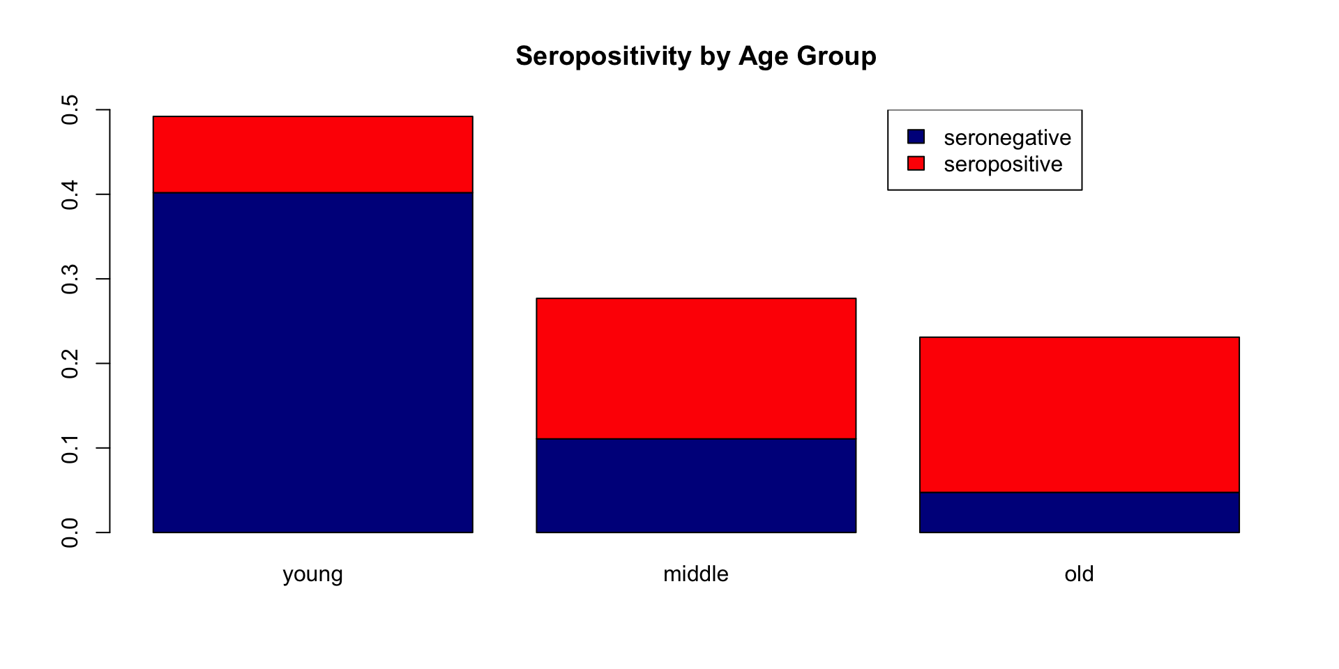
barplot() example
Getting closer, but what I really want is column proportions (i.e., the proportions should sum to one for each age group). Also, the age groups need more meaningful names.
freq <- table(df$seropos, df$age_group)
prop.column.percentages <- prop.table(freq, margin=2)
colnames(prop.column.percentages) <- c("1-5 yo", "6-10 yo", "11-15 yo")

barplot(prop.column.percentages, col=c("darkblue","red"), ylim=c(0,1.35), main="Seropositivity by Age Group")
axis(2, at = c(0.2, 0.4, 0.6, 0.8,1))
legend(x=2.8, y=1.35,
             fill=c("darkblue","red"),
             legend = c("seronegative", "seropositive"))
barplot() example
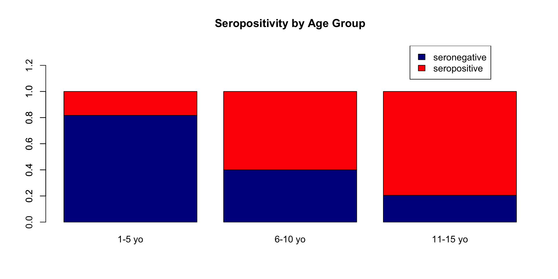
barplot() example
Now, let look at seropositivity by two individual level characteristics in the same plot.
par(mfrow = c(1,2))
barplot(prop.column.percentages, col=c("darkblue","red"), ylim=c(0,1.35), main="Seropositivity by Age Group")
axis(2, at = c(0.2, 0.4, 0.6, 0.8,1))
legend("topright",
             fill=c("darkblue","red"),
             legend = c("seronegative", "seropositive"))

barplot(prop.column.percentages2, col=c("darkblue","red"), ylim=c(0,1.35), main="Seropositivity by Residence")
axis(2, at = c(0.2, 0.4, 0.6, 0.8,1))
legend("topright", fill=c("darkblue","red"),  legend = c("seronegative", "seropositive"))
barplot() example
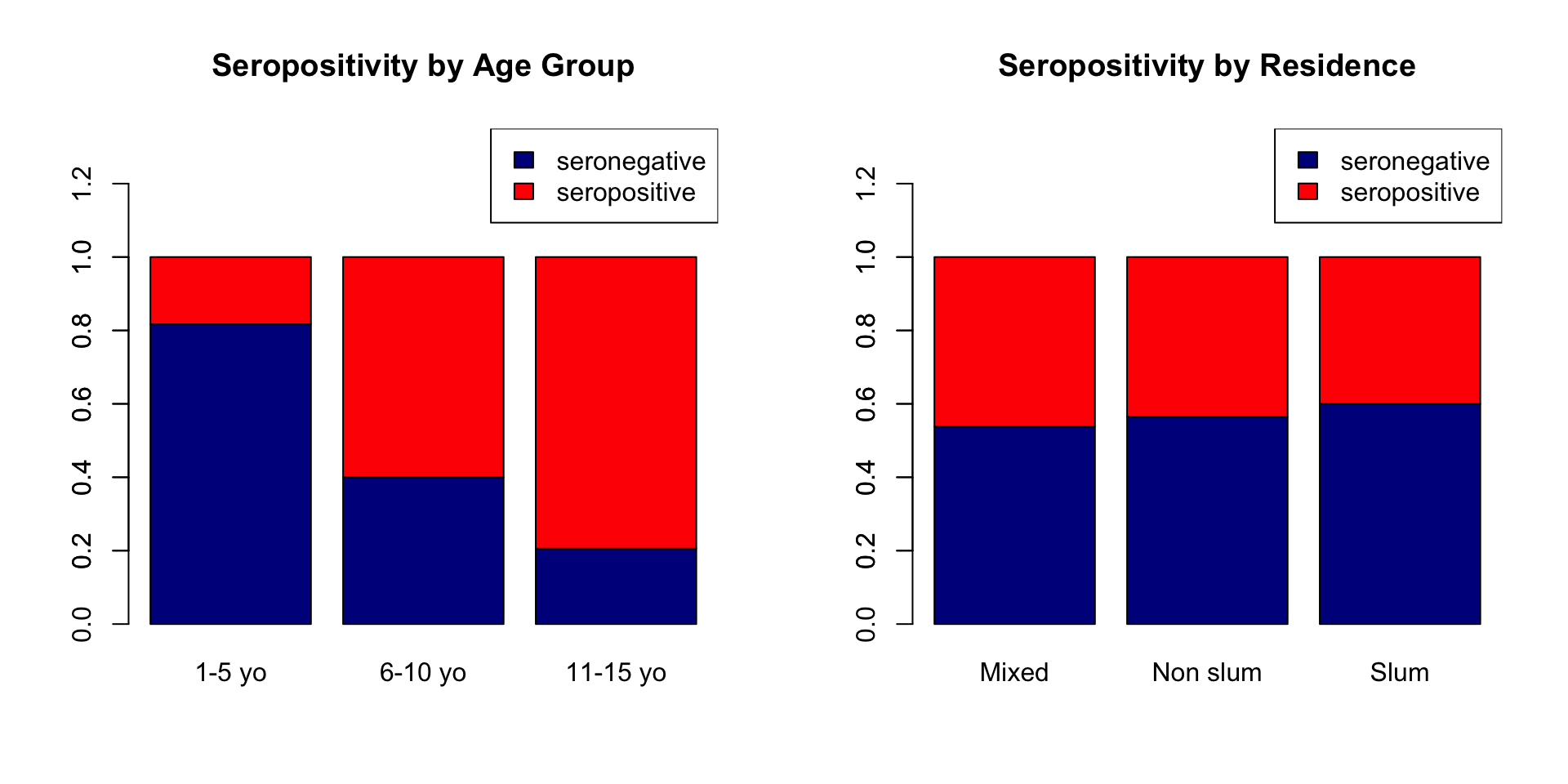
Saving plots to file
If you want to include your graphic in a paper or anything else, you need to save it as an image. One limitation of base R graphics is that the process for saving plots is a bit annoying.
- Open a graphics device connection with a graphics function – examples include
pdf(),png(), andtiff()for the most useful. - Run the code that creates your plot.
- Use
dev.off()to close the graphics device connection.
Let’s do an example.
# Open the graphics device
png(
    "my-barplot.png",
    width = 800,
    height = 450,
    units = "px"
)
# Set the plot layout -- this is an alternative to par(mfrow = ...)
layout(matrix(c(1, 2), ncol = 2))
# Make the plot
barplot(prop.column.percentages, col=c("darkblue","red"), ylim=c(0,1.35), main="Seropositivity by Age Group")
axis(2, at = c(0.2, 0.4, 0.6, 0.8,1))
legend("topright",
             fill=c("darkblue","red"),
             legend = c("seronegative", "seropositive"))

barplot(prop.column.percentages2, col=c("darkblue","red"), ylim=c(0,1.35), main="Seropositivity by Residence")
axis(2, at = c(0.2, 0.4, 0.6, 0.8,1))
legend("topright", fill=c("darkblue","red"),  legend = c("seronegative", "seropositive"))
# Close the graphics device
dev.off()
quartz_off_screen
2 Note: after you do an interactive graphics session, it is often helpful to restart R or run the function graphics.off() before opening the graphics connection device.
Base R plots vs the Tidyverse ggplot2 package
It is good to know both b/c they each have their strengths
Summary
- the Base R ‘graphics’ package has a ton of graphics options that allow for ultimate flexibility
- Base R plots typically include setting plot options (
par()), mapping data to the plot (e.g.,plot(),barplot(),points(),lines()), and creating a legend (legend()). - the functions
points()orlines()add additional points or additional lines to an existing plot, but must be called with aplot()-style function - in Base R plotting the legend is not automatically generated, so be careful when creating it
Acknowledgements
These are the materials we looked through, modified, or extracted to complete this module’s lecture.
- “Base Plotting in R” by Medium
["Base R margins: a cheatsheet"](https://r-graph-gallery.com/74-margin-and-oma-cheatsheet.html)